Client
Nespresso
Role
Art Director
Agency
Superunion
Year
2018
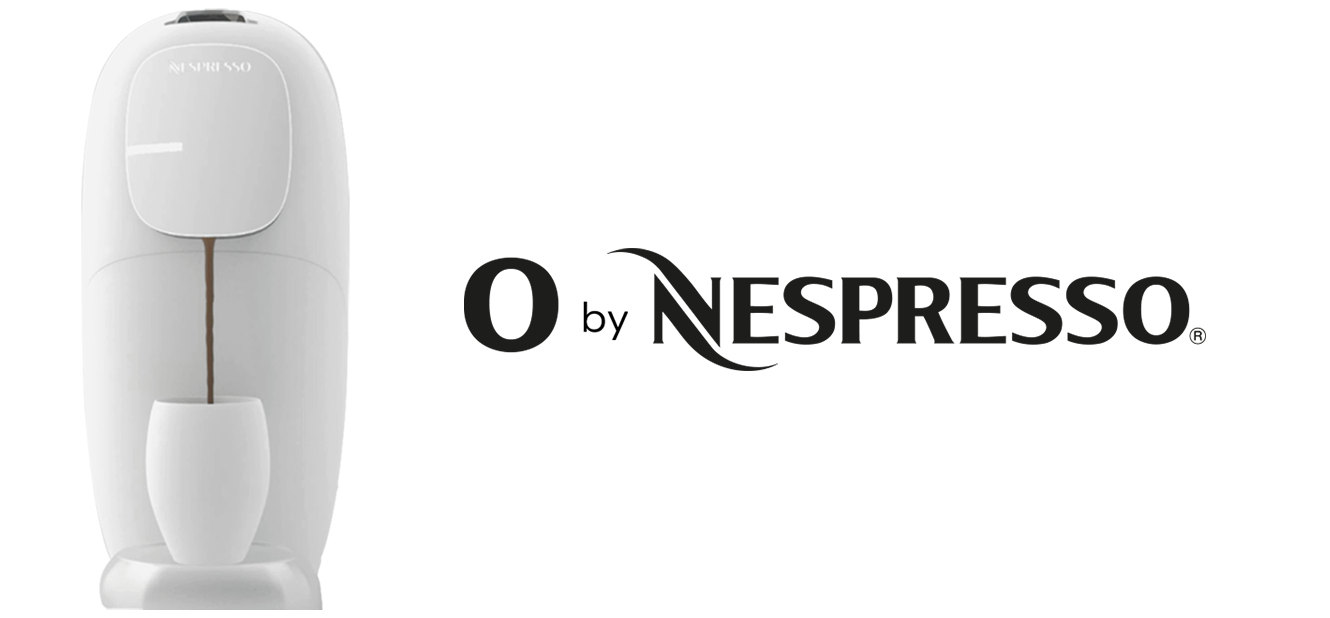
O by Nespresso
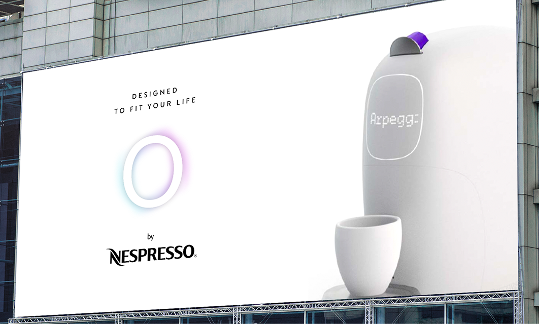
Branding of the new coffee machine
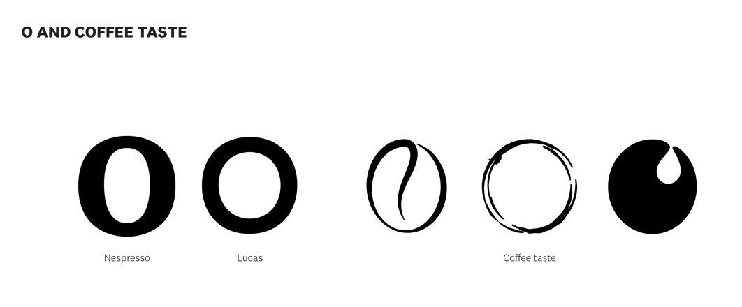
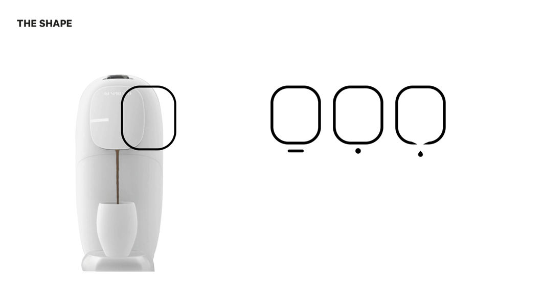
The pure, innovative and classy style of the new machine, inspired the team to keep the logo design simple and minimalistic. Exploring different prospectives of the O, working on analogies, shape and meaning, the last choice was the simplest: the O written with the Nespresso font, as underline of the brand belonging.


Some of the other proposals and explorations, proposed to the client, during the creative process.


Copyright © Lucia Domenici 2025
All rights reserved