About
Works
Founder and CEO
Founder and Chief Creative Officer
Branding
Creative
Campaign
Strategy
Design
Event
Live Action
Experience
UK+
Client
HMD Global
Role
Global Executive Creative Director
in house
Year
2024
HMD
Human Mobile Devices
Logo description
MADE ON OUR VALUES
The perfect combination of the brand name and symbol makes the new logo exceptional. The letters are readable, and their interaction creates an original design.
The way the letters merge creates a sense of compactness and unity, as each letter relies on the others to exist without losing its identity or shape. This bond among the letters reflects our spirit of collaboration and support.
Using capital letters transmits the solidity and impactfulness of the HMD brand. This bold and modern look reflects entrepreneurial spirit.
The new logo's simple yet direct design and the HMD abbreviation, which stands for Human Mobile Devices, make it human.
I had the pleasure of personally designing the new HMD logo.
At Nokia Phone, we're evolving from a licensee to a multi-brand company, introducing our distinctive HMD brand product line. As the founder and leader of the in-house Brand Studio, we're dedicated to creating, establishing, and nurturing this new brand identity. With a talented team of designers and 3D artists personally selected by me, we've crafted the new global creative direction in alignment with our brand guidelines.
- Brand Strategy
- Design
- Creative Direction
- Art Direction
- Global Brand Guideline
- Global Social Brand Guideline
- Global Retail Brand Guideline
- Assets for marketing
- Assets for PR
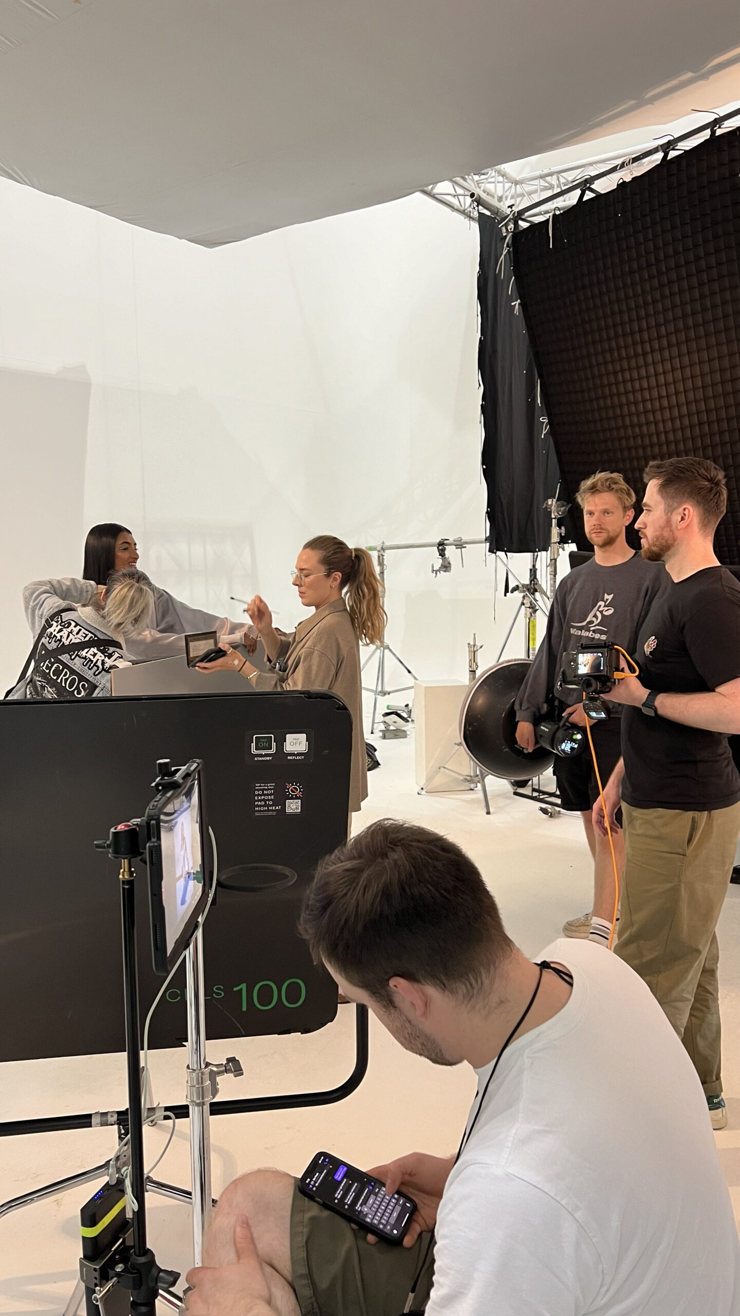
- Shooting and Photoshoot
- Post-production / Editing


At HMD, I/we followed a traditional creative process.
We created the brief, came up with the idea, found and briefed the right talent,
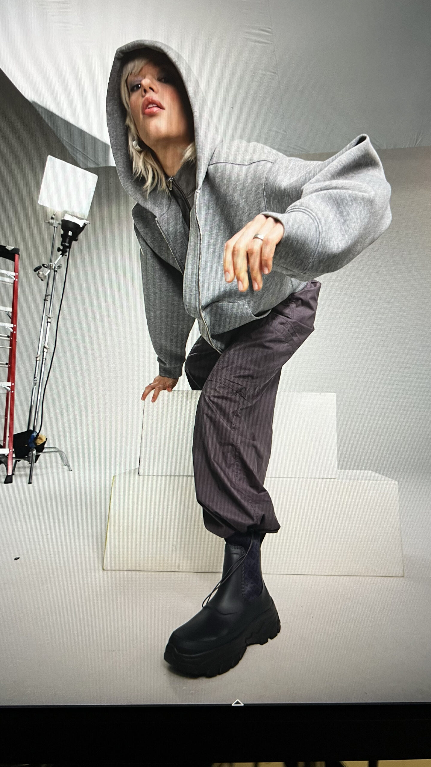
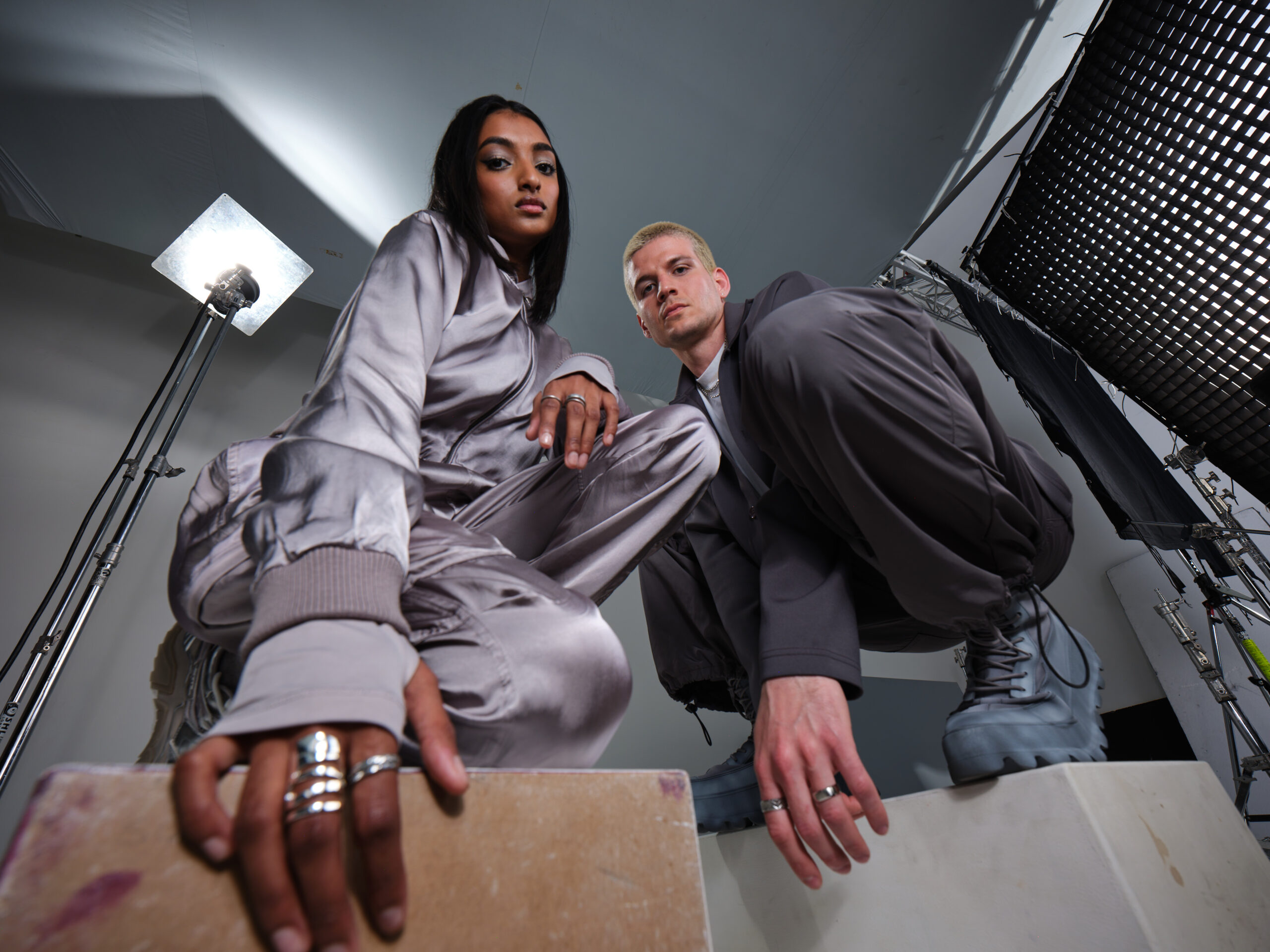
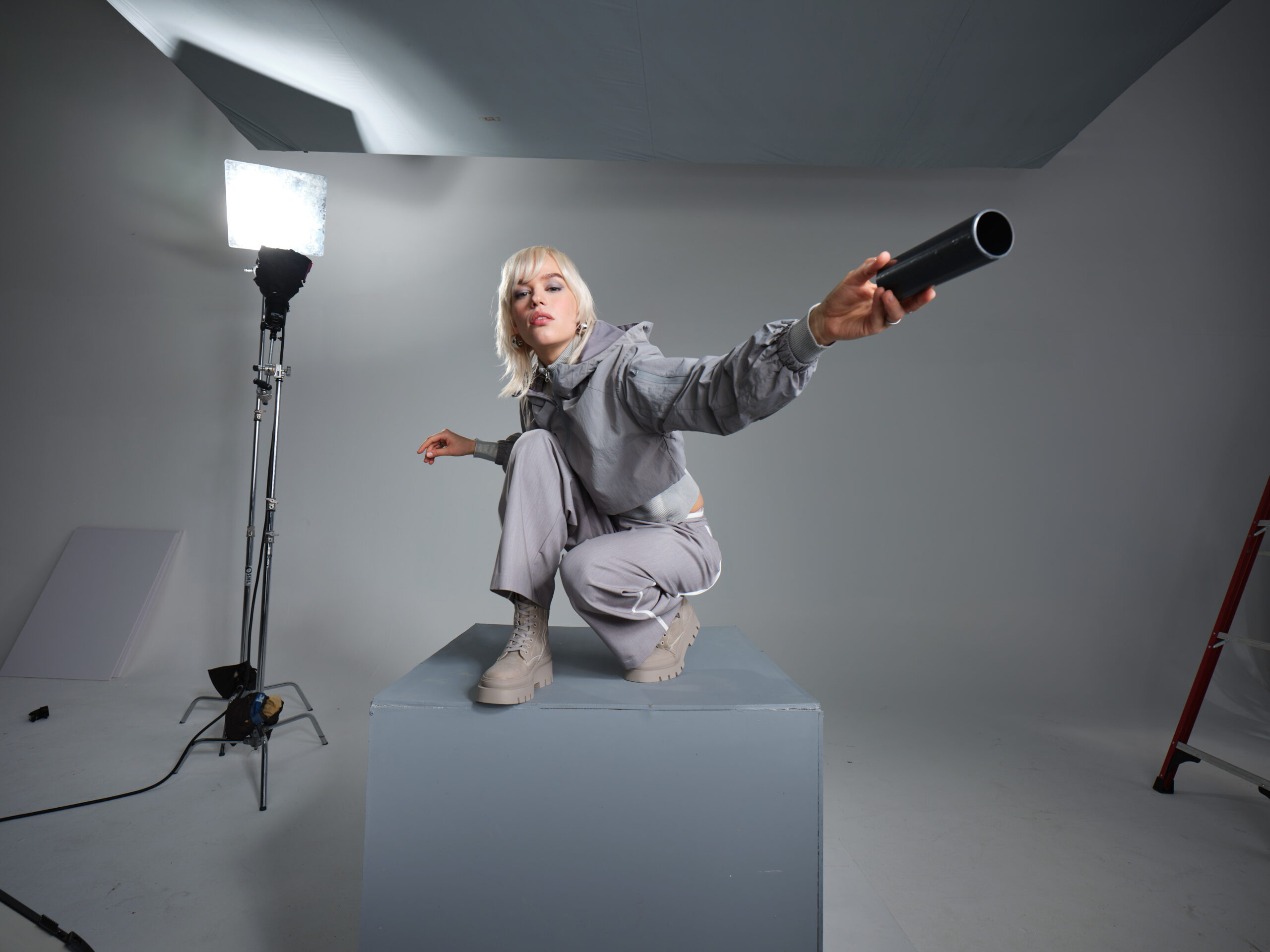
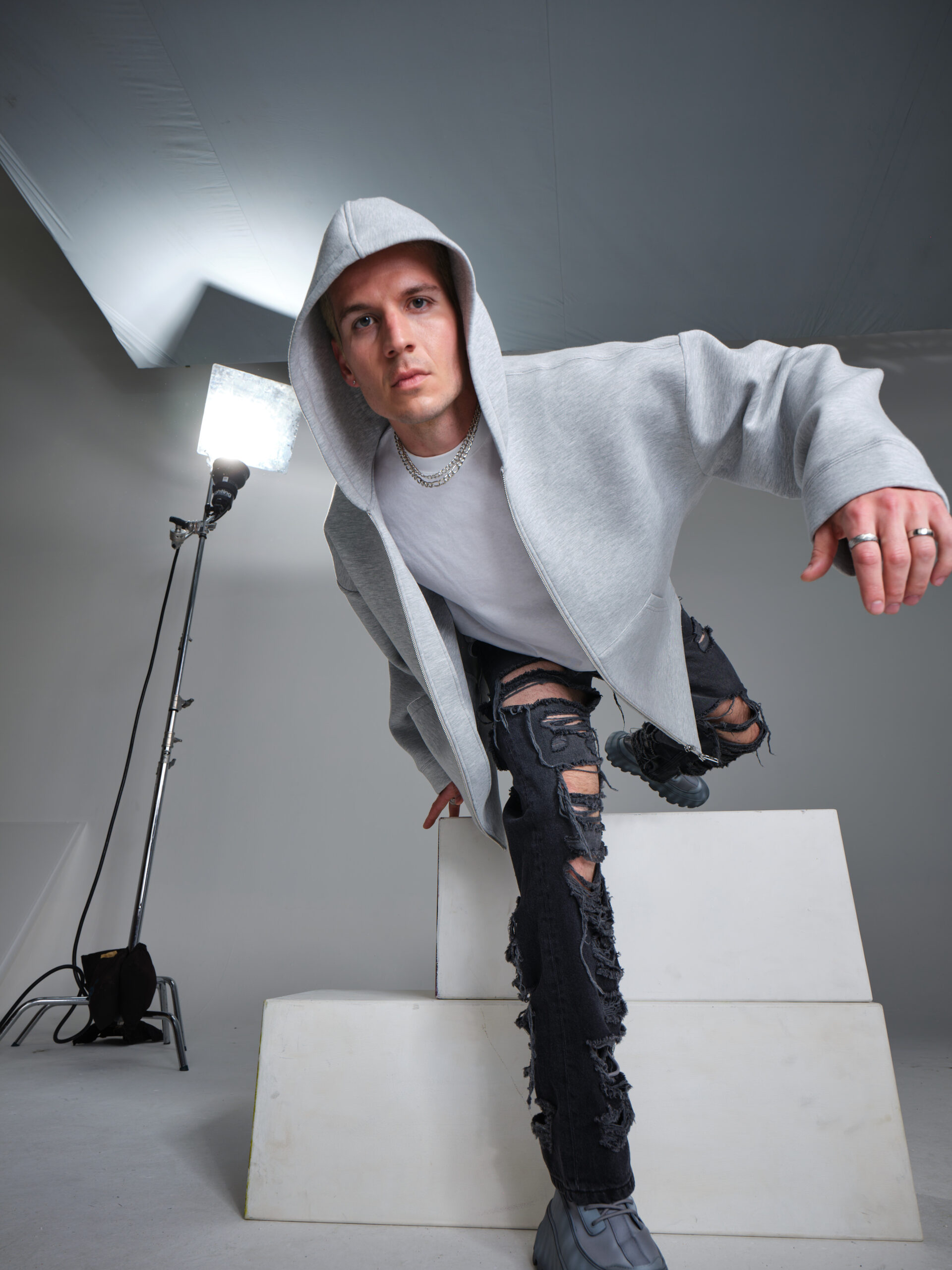
built the set, handled the lighting, and ran the shoots, then integrated the resulting scene
into a 3D format with the help of our 3D artists.
Creative Direction
Elevating Ordinary to Extraordinary with Innovation That Stands Out
Our design is about lifting everyday people to extraordinary heights, thrusting them into worlds of endless potential that break the mould and stand out. And like our products, which will sparkle in a sea of sameness, we offer consumers cutting-edge technology with top-notch features.
These innovations don't just make a splash—they make a real difference for people, partners, and the planet.


BTS
Copyright © Lucia Domenici 2026